2024
DW Logics
A leading player in the sleep tech space, Snooze is reimagining
the importance of sleep in the 21st century.
Branding / Web UIUX・Development / 3D Visual Design・Motion
Project Overview
우디즈는 ‘물류 업체와 차주를 원활히 이어주는 신뢰할 수 있는 파트너, 대운로직스'라는 의미를 담아 국내에서 원활한 물류솔루션을 제공하고자하는
브랜드를 위해, 유사 카데고리 시장에서 차별화된 경쟁력을 확보할 수 있도록 전략 및 정체성 시각화 및 웹사이트 디자인 솔루션 프로젝트를 진행했습니다.

Concept
대운로직스는 단순한 물류 기업이 아닙니다. 물류센터,차주 그리고 상품을 받는 고객까지 매일 생각하며 보다 나은 서비스를 제공하며 고객과 함께 동반 성장하는
기업입니다. 대운로직스의 브랜드 디자인은 신속성, 신뢰성, 친근함을 바탕으로 고객에게 빠르고 믿음직하며 친숙한 파트너 이미지를 전달하는 데 중점을 둡니다.

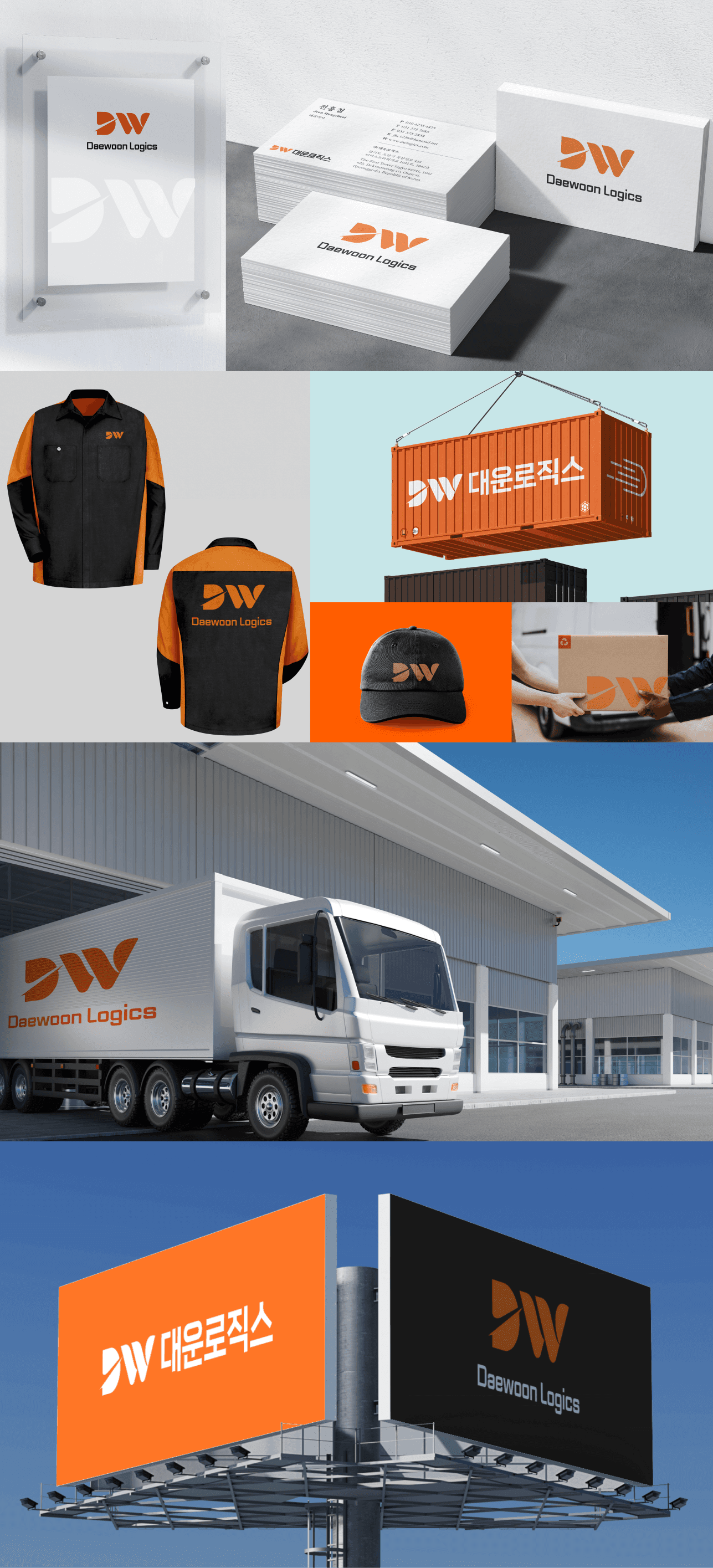
Brand
Logo Design
We designed a wordmark using the initials 'DW' of DW Logics. The design aims to express speed related to logistics centers,
carriers, and customer service, while conveying the familiarity and trust that DW Logics wants to embody.
The letter 'D' is represented in a rounded and solid manner toachieve this. Additionally, the rounded shape of the logo is
designed to connect ith the graphic system and web design, providing a sense of unity.

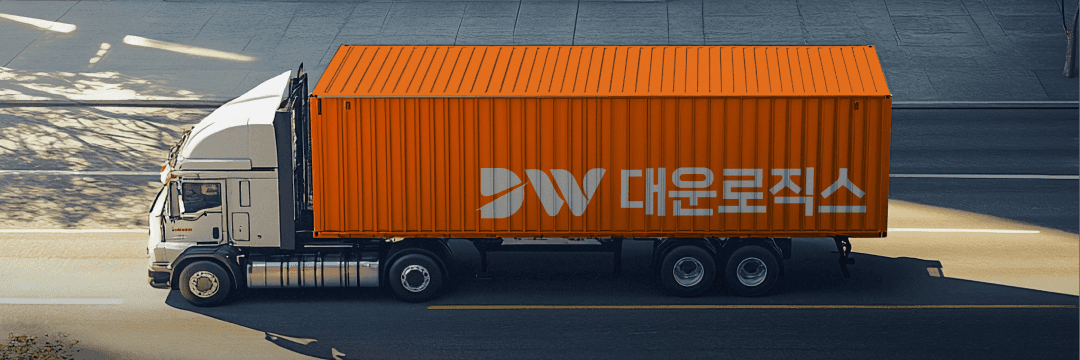
Brand
Colors
주황 색상의 의미는 대중적으로는 ‘원기,활력,적극,만족,용기’를 뜻하며 유교에서 주황색은 변화를 상징합니다.
대운로직스 20년이상의 경력의 물류 솔루션을 기반으로 한 신뢰와 끊임없이 변화하는 활력을 가진 변화를 상징하며
해당 브랜드가 물류업계에서 차별화된 경쟁력을 확보할 수 있는 정체성을 가지기 위함입니다.
The color orange generally symbolizes “energy, vitality, proactivity, satisfaction, and courage.” In Confucian philosophy,
orange represents transformation. Based on its 20+ years of experience in logistics solutions, Daewoon Logistics embodies trust
and a continuous drive for dynamic change, symbolized by the color orange. This choice reflects the company’s commitment
to establishing a distinct identity in the logistics industry and securing a competitive edge through adaptability and innovation.